Playfulness is the biggest compliment that can be made about your brand identity, says Grahame Jones of brand consultants Soukias Jones.
Hogan Lovells is a now a member. It has joined the ranks of Accenture, Cooper Parry, Deloitte and EY. This exclusive club has the confidence to play with their brand assets. Hogan Lovells is combining its famous lime-green colour and rectangle, as seen on its logo, to great effect in marketing communications.
The firm can do this. It has successfully developed a clear association between its lime-green rectangle and the Hogan Lovells name. Both are visual cues to remind audiences, ‘hey, this is Hogan Lovells speaking’.

This is part and parcel of developing distinctiveness. There is nothing to gain in developing a differentiated position, unless a firm stands out and is recognised. An organisation needs both: a differentiated position (standing apart from the competition) and distinctiveness (being easily distinguishable for audiences).
What are brand assets?
Brand assets are sensual identifiers of the brand. Both visual and verbal, they connect you to the brand’s positioning and its associations. Assets exist in different formats. And their importance differs between B2B and B2C marketing. For professional services, brand assets are more likely to include logo, shapes, colours, fonts, images, writing style and straplines. Whereas for consumer marketers, packaging, characters, music, locations and even celebrities tend to make up the palette.
How many brand assets do you need? Clearly, for any firm, the logo is the defining unique asset. But firms need others. Uniqueness in professional services however is hard to achieve. A colour for example is now difficult to own. Most if not all colours are used (pink is still available!). But that’s the creative challenge.
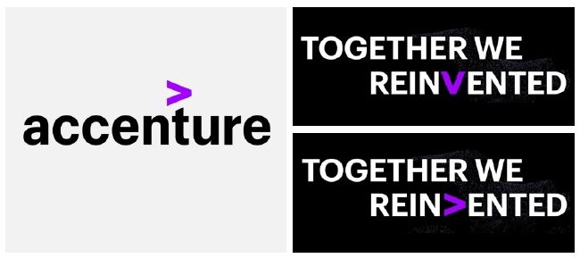
The challenge is made easier if brand assets are also meaningful. Accenture’s ‘greater than’ symbol links to its growth and transformational purpose.
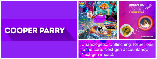
While Cooper Parry’s tone of voice reflects the firm’s maverick positioning in the mid-market.
EY uses a yellow rectangular to frame how the future could look. It symbolises the firm’s forward-thinking approach to uncovering new opportunities in times of change. Provides a visual link and reminder to the firm’s overarching proposition ‘Building a better working world’.

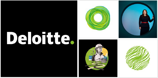
In a short time, the Deloitte green dot – creatively used on many applications, has become instantly recognised symbol of Deloitte. Simple in its conception, it has come to symbolise ‘why choose anybody else’ – the firm is the final point in your search, whether you’re a client or an employee.
Sometimes, however, it’s fine when a brand asset evokes only the brand name without also calling to mind the brand image. Other assets can originate from more arbitrary decisions. That’s also okay.
How to use brand assets
However they originate, be generous: apply them everywhere. Use them repeatedly and explicitly across all touch points. Overplay them. Yes, be tasteful and smart, and, of course, use brand assets in ways appropriate to your positioning and audiences. But always remember this fact. While you have been living with your brand assets and identity for many years, your audiences have not. Don’t assume your targets are interested, captivated or even realise that you exist. Can you recall the brands behind the ads you saw on TV last night? Or even the ads themselves? But if you want to improve your chances of making an impact, get these two essentials right. You need creativity and you need brand assets. With this winning combination, your audiences are more likely to remember that you originated that campaign or LinkedIn post. That’s the goal.
Why are they important?
First, distinctive brand assets make you stand out: they form a quick link to your brand name; and if used well repeatedly, connect audiences to your positioning. What’s more, no digital and social-savvy brand identity can exist without short-form identifiers of the brand. Assets also help maintain saliency. As this saliency fades, brand assets remind audiences, give firms a presence in their minds. They can also help shorten the last two feet; they help pull clients towards us when making that final purchase.
Achieving the holy grail
A brand achieves distinctiveness when it has a unique and unmistakable identity, based on a number of assets: such as brand name, logo, pattern, shape and colour. It gives permission to be playful too. But it takes time to reach this point. The Accenture symbol has been part of the company’s visual identity for more than 20 years. Patience is a must!
Grahame Jones has worked in professional services branding for more than 25 years. For more information, contact grahame@soukiasjones.co.uk or visit www.soukiasjones.co.uk


