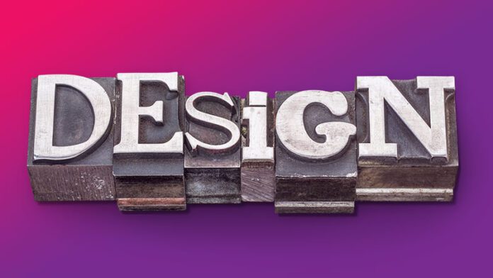
Typography plays an important role in designing a professional services logo. It helps convey a brand’s identity, values, and message effectively. Here are some key reasons why typography is crucial in logo design for professional services:
Brand Identity
Typography is a visual representation of a brand’s personality. The choice of typeface, style, and typographic arrangement helps communicate a brand’s character, be it modern, traditional, elegant, innovative, or trustworthy. This is especially important for professional services, as the logo needs to help establish credibility and professionalism.
Legibility and Readability
A firm’s logo should be easily readable across a broad range of different sizes and mediums. Good typography ensures that the company name or tagline is legible, whether it’s on a business card, website, or signage.
Differentiation
In a crowded market, your logo needs to stand out and be memorable. The right typography can give your logo a unique and distinctive look that helps brand recognition.
Emotional Impact
Typography can evoke emotions and create a certain mood. A professional services logo should communicate trust, confidence, and reliability. The right typography can help achieve.
Consistency
Typography is a critical element in creating a consistent brand identity across all touchpoints. From business cards to website banners, consistent typography helps build brand awareness.
Hierarchy and Focus
Effective typography allows you to establish a hierarchy within the logo, guiding the viewer’s eye to the most important elements. This is especially important when including both the company name and a strapline or descriptor.
Cultural and Industry Fit
Different industries and cultures have varying design aesthetics and expectations. The right typography can help your professional services logo resonate with your target audience and industry norms.
Versatility
A professional services logo needs to work in various applications, from digital to print. The chosen typography should remain effective and adaptable across different mediums.
Timelessness
Professional services often aim for a timeless and enduring brand identity. Typography can contribute to this by avoiding trendy fonts and styles that might become outdated quickly.
Legal and Copyright Considerations
Using custom or modified typefaces without proper licensing can lead to legal issues. Choosing established and reputable fonts helps avoid such problems.
When designing a professional services logo, it’s important to consider all these factors and collaborate with a skilled creative agency that understands the impact good typography can have on branding. The typography you choose should align with your brand’s values, target audience, and industry positioning, creating a lasting and powerful visual representation of your professional services.


